The Digital Ream

On April 5th, 2006, Nick Montfort sat down to write Ream, a 500 page (and word) long poem, with each page consisting of a single, one-syllable word in 14 point font. Later, this poem was translated into French by Anick Bergeron. But, before that, Montfort turned the poem into a literary hypertext for our digital pleasure. The result is (very basically) a webpage with a black background upon which a single word is written. Clicking on that word leads us to the next word, and clicking on that word leads to the next, and so on and so forth until you reach page 500 where clicking on the final word “zoom” brings you back to the the “title page.”

For all its simplicity, Ream gives us a lot to work with in terms of seeing adaptations from print to digital. Last week in class we seemed to get bogged down by the idea of adaptations of works intended to be printed, represented in the digital sphere, as opposed to works instantiated in the digital to begin with.Reampresents an interesting case, as part of me feels like Montfort may have envisioned this print work also as a digital work to begin with (doesn’t seem that far off an assumption since Montfort is quite the name in electronic literature circles). One thing the digital version of the poem inspires is the idea that each word in a work (whether print or digital) is basically a gateway to the next. In this case, each word is very literally a gateway, a piece of hypertext taking you to the next word once you’ve pressed on it. This emphasizes the importance of all words in the poem, and helps us feel as if there is purpose and connection to each word despite the apparent lack of coherence between them. In fact, the poem seems to speak more to the idea of how we read, and that we should take care to connect each word to the next, rather than actually presenting a story that demands this reading. For one, you must obscure the word in order to click on it, and secondly (as stated previously) there is not an immediately obvious contextual connect between these words. Furthermore, each word is embedded with a particular link to the next word. You cannot press word 230 (grim) and get anything except word 231 (groves). This emphasizes an order and an intention that we seems to sometimes miss with a lot of electronic literature that offers numerous links and seemingly infinite pathways. This is not to say that you cannot edit the URL inside the search bar to skip to a word “further down the ream,” which you can, and I most certainly did. While the print version may inspire some of these feelings, I think the use of digital hypertext is really a superior way of understanding how important word order and connection is.
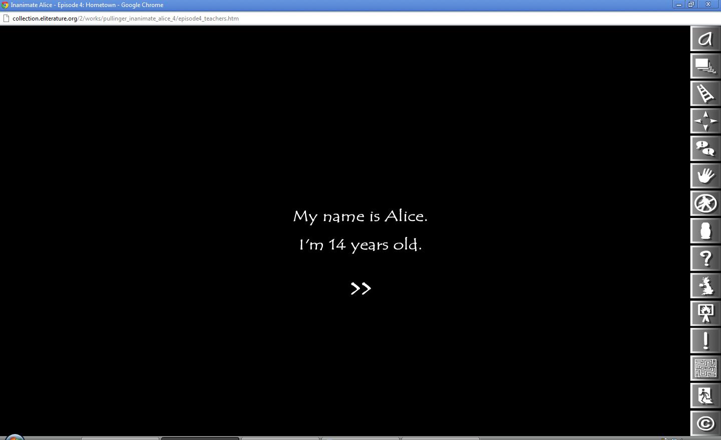
A New Wonderland

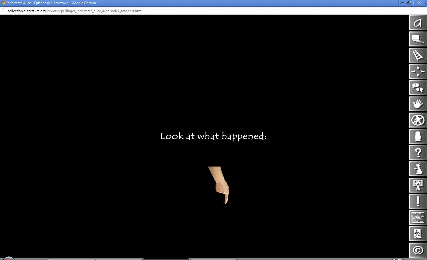
I only wish I had Inanimate Alice when I taught remedial reading in a public high school just a few years ago.  I can imagine my students—a wide mix of cultures, races, social statuses, and reading abilities—shouting at the scenes displayed on the Promethean Board: “Click where that hand appeared!” “What do those boxes on the right do?”  “Check out her pad first!”  “Move the mouse somewhere else!”  “Play the game; play the game!”—to move the story along.

On their website the creators, Kate Pullinger and Chris Joseph, state that the purpose of the “transmedia project” was originally for entertainment; however, the site clearly markets to educators with a section called “Teach with Alice” and descriptions such as “A reading-from-the-screen experience for the ‘always on’ generation.”  They also throw this piece into the fire of the literature-in-the-curriculum debate by asserting “new media demands new literacies.”  Thus, I suspect that teachers saw the learning-potential in Inanimate Alice because of its transcendence across nationalities and media types and used it in their classrooms before it was promoted as such.  It is probable that once Inanimate Alice found its niche in the world, the creators took that idea and simply showed people.

Digging deeper down the rabbit hole, I can hear teachers making their case that “Inanimate Alice is the future of literature”—for the title itself conjures a character from an old, canonical text, Alice in Wonderland.  Both Alices are the about the same age, are inquisitive and imaginative; yet, the modern Alice is older (and ages throughout the series); travels to actual versus seemingly imaginary places; and tries to interpret/engage in her world using a digital device instead of a book.  Therefore, it represents the shift in way childhood is perceived and lived.

Back From the War

Creative Response-  My Boyfriend Came Back from the War

In this piece, the interactive art was very interesting- for example, the window image flashing reminded me of bombs for some reason, timebombs specifically, like there was only a matter of time until the end.  It’s repetitive flashing causes an uneasiness that I couldn’t shake.  The flashing window also reminded me of a pulsating heart which could stand for the love between two people, or the quickening of a pulse because of nervousness, whether it be from love or fear.

During the part where it says “Where are you, I can’t see you”, I felt sad which shocked me.  This kind of broke my heart because of stories I read about PTSD and coming back from war.  Sometimes people change so much that they are unrecognizable.  My husband’s cousin died in Afghanistan, and this question “Where are you, I can’t see you” resonated with me as well.  I never got to meet his cousin, and my husband sometimes says he can feel him around, but not see him.  I’m still undecided about the whole afterlife thing, but that is what this part of the media reminded me of.  A bit strange and hard to share, but there it is.

“Look, Salute, In Honor of You”…. The words on the bottom right side of the page that you can click are positive words, but then they change to read: Red, GREEN, Blue.  I found this very interesting, this change of our country’s colors really stood out to me, although I wasn’t sure what it meant.

Also interesting was the graphic in the middle of the soldiers and helicopter.  The background was black and the image white, but when you click on it the colors reverse to a white background and black image.  This could portray many things, such as the change that occurs in a person because of war, or the changes that war causes in general.

The repetition of clock images as I clicked through was also interesting to me.  Overall, this was a very thought provoking piece.

DAWN

In Alan Sondheim’s, DAWN, the viewer is faced with a rather odd poem that appears to be, at first glance, rather depressing. The lines of the poem fade in and out, some quicker than others, overlaid on top of changing pictures of nature. The sound that plays while the poem runs is an annoying, crunching or clicking sounds of some sort. It’s not a sound that one would normally hear in every day life. It’s a constructed sound, which is very different from the rest of the experience of the poem and visuals that go with it. The poem and the visuals are organic and from nature. The sound takes the viewer out of the realm of nature. It’s almost as if the author is trying to tell you that he does not want you to view this as beautiful. That there’s a deep meaning behind his words. The poem itself is a mixture of beautiful and sad. With the visuals in the background, I believe it would be easy for the viewer to come away with a sad, but hopeful view, but the intrusive sound does not allow this. The feeling becomes panicky and uncomfortable. The longer the poem went on, the more uncomfortable I felt. The three different parts of the poem (the lines, the visuals, and the sound) work together to create a very powerful piece about life, death, and the beauty and sadness of this world. I don’t believe that there is any easy way to interpret what the author is trying to convey. The author does, however, seem intent on finding some sort of balance between the good, beauty, evil, and sadness of the world. The poem is fraught with these concepts.

One other thing that I noticed was that the second to last picture had a figure in it. All of the other pictures are different variations of flowers, fields, trees, and water. In this picture, there is a female standing with her head down. It has a very different feel to it than the other photos. The lines of the poem that appear with this picture are about a woman who will rise when the character, “I,” dies, and will sleep when “I” dies. Perhaps the “I” will sacrifice himself for this woman. It is a very powerful moment in the poem with the visual of the woman accompanying those lines. The lack of human figures in the other visuals makes this one so much stronger.

Self Portrait(s) [as Other(s)]

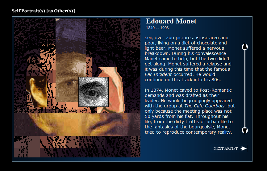
I came by Self Portrait(s) [as Other(s)] via Between Play and Politics: Disfunctionality in Digital Art, one of our assigned readings, and was immediately perplexed. The artist has created 120,000,000 possible recombinations of artists’ images and biographies. Amazing!  I suppose this is the magic of code and database type media.The sheer number of combinations is not the only reason for my vexation.

Edouard Monet: a fictional artist

In a very E. E. Cummings style, even the title has its own possibilities for recombination (Self Portraits as Others, Self Portraits as Other, Self Portrait as Others, Self Portrait as Other, Self Portrait, and Self Portraits) The artwork is a thought-provoking, digitized departure from Brion Gysin’s poetic cut-up style, which might place this work in the box of Surrealism or Dadaism, but I admit to being fearful of categorizing. The cut up style, and especially the narrative biographies and fractured images that result from it, seem to beg for the viewer to toss aside these distinctions and not force the artists to unhappily submit to the pressures of an artistic label. I can say, without guilt, that the work shares some questions/criticisms with the cut up method; questions of authorship. Yes, Memmont wrote the code that generates the portraits and biographies, but he certainly did not create the portraits and may or may not have generated the biographies.

If we place our pointer over the mouth of a portrait a quote comes up. In this case the quote matches the mouth from which it comes; however, the mouth is just one tiny part of the work. There may be a slim chance that the mouth and other parts of the image match, and another miniscule chance that the image matches the biography. In this sole case, identity is completely clear.

Obviously, the artist sees himself in all of these other artists – their successes and failures, falling outs, lives and deaths. Oddly, most of the combinations that I have run into, granted I have not clicked around the artwork 120,000,000 times, have created stories of frustration for the artist. They are forced into artistic movements to which they do not want to belong, they make good friends and then do not talk to them anymore, they get arthritis and can’t work or can barely work. I guess art, authorship, and the cut up method are just downright frustrating, or at least, Memmont might think so.

“Twelve Blue” and hypertexts

“Twelve Blue” by Micheal Joyce is a web hypertext which was written in 1996 (http://www.eastgate.com/TwelveBlue/).  From the home page, the reader can begin following a series of narratives by either clicking on a link within the story itself, or clicking on a colorful thread off to the side of the story.  For me, this made the stories hard to follow.  While you could choose the simple path and click on the text within the story, clicking on the various threads would allow you to change which narrative you were reading.

Although this was somewhat of a frustrating read for me, it was also very interesting in light of things that we have discussed in class.  These short stories being presented in a digital format allows the reader the freedom to choose the order in which they read the narratives.  In theory, you could also do this with a book; you could pick it up and turn to any page in it, and skip around reading only the passages you choose.  However, the book is not set up for this format, and readers have been trained to read printed books in a linear manner.  With “Twelve Blue,” the threads on the side are readily available to click in whichever order you want, and the viewers may be more likely to try this out because they are used to clicking on things on the screen which interest them.  At points, clicking on the threads becomes the only option; some screens do not have links within the text, and in this way the story forces you to choose a thread to follow, with no way of knowing whether it will lead to a continuation of your current narrative, or another part of the story.  This reading reminded me specifically of Hayle’s nine points about electronic hypertexts, especially point seven: “electronic hypertexts are spaces to navigate” (Hayle).  “Twelve Blue,” as a hypertext, is designed as a story to navigate your way through, not a series of narratives to read in a standard, linear manner, and the threads and links within the story constantly emphasize its digital properties.

The Philosophy of Bacon

Bacon, one of six children,
both domestic and foreign,
is mounted on a pedestal.
From a functional perspective,
although it need not be of material existence,
he appears to both involve and facilitate abstract thinking.
There is a philosophical system known as Bacon,
in the face of an apparently meaningless or absurd world.

Scrolling Annoyances

Bright Morning Blue is a simple, scrolling comic about a man’s morning, frame by frame. Rather than the content of the story that’s being told, I am more concerned with the pacing of the scrolling frames and how that effects my ability and interest in viewing the comic strip.

There are two ways to scroll through the comic. You can either A), use the directional key pad to scroll continuously from left to right, or B), hold down the scrolling bar icon to allow the comic to scroll continuously. I have found I have an issue with each of these options. By using the directional keypad, the comic scrolls by too quickly, not allowing me enough time to focus on the panels, forcing me to adjust my pacing in order to effectively view each frame in the comic. However if you switch to the scrolling bar, the pacing slows dramatically, allowing you ample time to study each panel of the comic. It took control on my part to allow the comic to scroll at this pace, and not to rush through it at my own desired pace.

Because option A is literally too fast to properly view the comic, I can only assume that option B is the intended pacing. If that is the case, the intentionally slow pace brings out the simple morning routine details in the comic, as you are forced to view each panel for much longer than you might have intended originally.The author also controls how long we view each panel by creating longer or shorter distances between each frame, placing significance on some frames more than others, and allowing for a quickening or slowing of action.

However, what if that wasn’t even intentional? Of course the actual distances between the frames is an authorial decision, but what about our scrolling pace? We are given the option to scroll through the comic at our own desired pace, clicking through, creating a disruptive, choppy viewing of the comic. While I appreciate the option, I don’t believe it is necessarily conducive to an effective reading of the comic. So am I to assume that the painfully slow pace of the scrolling bar is the intended viewing speed? I would like to think so, but I can’t be sure. And how would the comic be affected had the viewer not had the option of controlling the pace? Would I have grown frustrated, unable to stop the flow of the comic? So I suppose the question is, where do we draw a line between the intent of the author and the convenience of the reader?


While we stand and focus

“Still Standing”, a new media poetry instillation is a crafty piece of work. The adaptive text is engrossing to see and the shape of the body serving as a template is engaging. The interactivity is merely being, while is akin to just sitting and reading, but forming the reading platform with the human body.

I think of the examples of digital media portrayed on http://www.dreamingmethods.com and think of how engrossed the reader has to be to read the content. The effects, presentation, and style of writing is designed to be viewed on a computer and could not function as a print text. The poem could be viewed in either media but settles in the “in between”. It seems to act as an artifact more than media. Some great inventions had predecessors that served little to nothing in terms of usefulness and practicality in the eyes of the user.  In the past, that’s been the virtual boy to the Nintendo 3DS, the laser disc to the dvd, the PDA to the smart phone, and more. And this technology is, while unique and interesting, not terribly mainstream or convenient that is has been picked up yet. The “in-between” literature has not found a home and I believe it will evolve as the technology advances and the ideas make the form more accessible.

As for the actual nature of the text, it’s a pretty significant comment one the business of today’s society. Not that it has not been busy in the past, but it seems with the digital age, people are more engaged with their devices than ever before. People become almost cyborgs as the devices act as extensions of the communicative behaviors. Now, the device used to manifest the poem becomes an extension of our perceptions of reading.

This “in-between” text is unique in it’s qualities and it is a media that can be modified and exported with ease, as opposed to a book, which would require a secondary editing, printing, and shipping process. It is just strange to see the media presented as an embodiment of the self instead of merely squares of text like the ones above this sentence.

It’s a truth universally acknowledged…

Can we treat a youtube series based on Pride and Prejudice as a piece of literature in its own right?

The Lizzie Bennet Diaries are the brainchild of Hank Green (of Vlogbrothers fame) and Bernie Su and aim to re-tell the story of Jane Austen’s famously unwed Bennet sisters. Lizzie is now a 24 year-old grad student in mass communications, living at home and filming a semi-weekly video blog with the help of her best friend and classmate Charlotte Wu. The episodes, averaging about 4 minutes each, follow the basic plot of the novel with a few tweaks: Mary Bennet is their cousin, Kitty Bennet is a Lydia’s cat, Mr. Bingley is now Bing Lee, handsome doctor-to-be, and Mr. Collin’s proposal is a job offer.  That said, I’m not terribly interested in the actual content of the videos or how it has to change from the original to make sense in a 21st century context. Mrs. Bennet is still overly concerned with eligibility of her daughters and George Wickham is still a bit of a smarmy prick.

The shift of platform, medium and genre, while telling essentially the same story, accommodates interaction in a way the previous re-imaginings of this work, however true to the original or wildly off-script, simply cannot. Using Youtube’s established comment system, the audience interacts with the narrative (and with other audience members) in the comment section. Responses range from warnings to this Lizzie not to trust Wickham’s version of events to viewers who have not read Pride and Prejudice and are responding with Lizzie to the plot as it unfolds. Within the context/structure of the video blog-as-narrative-tool, the audience asks questions of Lizzie, which Lizzie occasionally answers in special episodes. Suddenly this sequestered, canonized fiction recreates itself as mutable reality. No where does the artificiality of the performance reveal itself (except under the narrative, where a production list indicates to the audience that this is a performance…Interestingly, one of the characters is played by Lonelygirl15 cast member, Maxwell Glick. That early web series caused a stir when it was revealed that it wasn’t an actual video blog, but a scripted show.)

In the medium of the video blog as personal diary, the perspective of the work shifts from third-person omniscient(ish) to first-person (fairly) limited. The technology of webcam affords the audience only a narrow glimpse into the girls’ lives and the show creators exploit that limitation for narrative effect. Outside a brief foray to vidcon (where the actress as Lizzie fangirls her series creator…playing himself) and a somewhat more extended stay at the Lee’s while the Bennet house is renovated, we do not see the girls outside Lizzie’s bedroom. This in itself functions as a comment on Austen’s own limited scope. While Austen excelled at capturing family life for women of a certain class in England in the early 19th century, her male characters lack that same richness and typically fall into three camps: good, good but brusque, and awful. The Lizzie Bennet Diaries drastically limits the appearance of all the other characters. Instead, we get them though Lizzie’s retellings and reenactments (with the help of Charlotte, Jane, and Lydia.)

Surely, no one would say that watching this series is identical to reading Pride and Prejudice. But it does force us to ask how this is different. In many ways, the comment section suggests that this re-telling mimics the earlier experience of the text: the viewers want Lizzie to be happy and are hurt by Bing Lee’s sudden departure. The comment section could even be said to function as an online book club. No one there is “reading” this text as we would for a class…but how many people read analytically outside an academic or professional setting? If the book is its story, this is not fundamentally different. The Lizzie Bennet Diaries doesn’t replace Pride and Prejudice any more than any of the other countless retellings and adaptations If anything, the changes in medium and genre that force the narrative’s interactivity interrogate what it is to experience a book and what it means to be a text.