Stylistic Elements of /Shooting War/

Overall, I wasn’t blown away by Shooting War. However, that is not to say there aren’t parts of it that really got my attention, especially stylistically  so. I’m not exactly sure how the authors created the webcomic, but it looks like something straight from Comic Life, the Mac application that comes automatically with most of their newer computers. The way the word bubbles look pasted on top of the art instead of fully integrated into it is what specifically reminds me of this program, and it is this perceived lack of integration between the words and the images that initially put me off from the comic. I thought it looked cheap, and sort of rushed through; however, that’s not to say that the creators didn’t succeed in doing some pretty cool things with what they were working with.

One thing the creators did that I liked can be seen in Chapter 2, scenes 5 and 6, where the interviewer’s word bubbles are literally laid over top of Jimmy’s when she is interrupting him. It’s not a huge thing, but it was a place where I felt the word bubbles were doing more than just sitting on the page narrating the story. I feel like in so many of the scenes the bubbles begin to take over the frames, mostly due to what looks like a lack of space. In other cases, instead of doing bubbles, the narration or dialogue is simply typed on the side of the frame with a black background. At least in Chapter 2/Scene 5 and Chapter 2/Scene 6 the bubbles are given the physical task to represent the actual overlaying of voices (the interruption) in the story’s action. I felt this was one place that the word bubbles were doing more than just sitting on the page taking up space.

Another place where I think the author’s succeeded in doing something interesting with the words was in Chapter 2/Scene 13. Here, in the middle panel, some of the words  (“There’s nothing left for you here.”) are actually taken out of a bubble and placed directly in Mr. Newfeld’s eye. The effect is that Mr. Newfeld’s eyes are what is conveying the message to Jimmy that nothing is left for him in New York, or even in America. While the text could logically follow from the bubble immediately before it, and then the bubbles after it could act as further explication of Burns’ situation, I read it as all the bubbles being a continued sentence/thought, and the text in Newfeld’s eye as it’s own message. This is both because of the placement of the text outside a bubble and because I think the look Newfeld is giving Jimmy is supposed to convey a much more direct and to-the-point message than his actual words. Newfeld is a news man and a business man, and as such quite throughoutly long-winded, but here we encounter a place where the man can convey a simply, though depressing, message with just the expression of his eyes.

I’m going to stop with these two examples of interesting things done with the text, but another sort of related cool thing is in Chapter 3/Scene 4, where the rocket actually stretch the length of the scene, across 3 panels. The way it connects the scenes and portrays a sense of time and imminent danger, I though, was really cool.

Exit Wounds

I was kind of at a lost as to what to write about in terms of Exit Wounds. Like discussion on the Twitter shows, I just wasn’t sure why this graphic novel received such mass amounts of praise, recognition, and awards. Upon finishing the book I was at a complete loss as to what made people think it was such a substantial piece of work. Don’t get me wrong, I really enjoyed the story, and I didn’t have the desire to put it down out of boredom once; however, it also didn’t strike me as something that would be on Time Magazine’s best graphic novels of 2008 list. I just didn’t think the love story or the mystery story were that original, or that amazing, and the art left something to be desired.

Maybe it’s the subtlety with which Modan goes about conveying themes and meanings that made me sort of miss the triumph of the book on the first time around. After reading the interview and some others’ blog posts, I can see I missed a lot of the successes of the book. For instance, I automatically assumed when characters were talking about suicide bombings that they were directly referencing the Palestinians, but as Joe Sacco points out, they are never actually mentioned. In some ways, my assumption is exactly the point Modan is trying to convey: this conflict is so very everyday to those who live in Israel/Palestine, as well as those of us who watch CNN or BBC.

I also didn’t really bat much of an eye at the fact that we don’t meet Gabriel the entire book. I guess it was another assumption I made that plot-wise Modan would either choose to Gabriel discovered (in one way or another) or make him end up being dead. It wasn’t until John pointed out that his absence is “haunting” the text that I put anymore thought into it. That, combined with Phineas’s post about the title pointing out that people are scarred by others’ exits, and therefore absences, made me realize that Modan could never actually let the reader see Gabriel in order for the love story between Koby and Numi to have weight.

In the end, I find a lot more to be impressed about by Exit Wounds, but I guess I still take issue with so much of the brilliance being in what is left out, than what is actually there. I think this is why I was generally unimpressed to being with: what we are presented with is a fairly average story. What Modan actually shows us and gives us isn’t this spectacularly brilliant thing until we realize that something is missing, that this is unusual, unique, and brilliant because it is somehow out of the norm of the way real life is.

Black Humor in Maus II

One thing I really couldn’t get over in Maus II was the greater presence of dark humor than compared to volume one. Maybe it’s just me (since I know of at least one other person who didn’t find any of these things funny), but throughout chapter 1 of the graphic novel I kept finding little things that, if not about something as atrocious as the Holocaust, I might have found laugh worthy. That said, I do think that Spiegelman’s (Vladek’s narration and probably some of Art’s creation) language takes on a more fatalistic and ironic tone. I know I mentioned this on the Twitter, but here are the three examples I found early on:

1. 

This image is from page 26. What I find particularly “humorous” is Vladek’s narration at the top of the second panel. “One guy tried to exchange,” he says. Short, sweet, but an entirely ridiculous thought when you consider that this is Auschwitz, why would this “one guy” even think he could exchange anything if he had barely eaten? More to the point, why is this small anecdote included in the story? Of course anything Vladek can remember is gold for Art’s Holocaust story, but this way this memory is presented just seems to have an entirely different ring from most of Vladek’s story. Additionally, the politeness with which the “one guy” approaches the Pole is somewhat amusing. It is almost reminiscent of Oliver, “Please sir, may I have some more?”

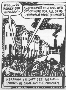
2.

Here I find the repetition about chimneys, and the way the dialogue becomes almost prophetic of Abraham’s unfortunate demise, to be humorous. The mirroring of Vladek’s concise and matter-of-fact narration and the fatalistic dialogue included in the scene come together to form a somewhat depressing, somewhat ridiculous and comical effect.

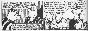
3.

In this frame I see humor in Vladek’s affirmation that the Priest who gave him hope and strength was indeed a Saint. When Art says that “that guy was a saint,” I, as a reader, hope that such a saint would survive the event, but of course, to become a saint one must, quite literally, never be seen again. Also, the abruptness with which Vladek agrees lends itself to a humorous tone. And finally, the excitement with which Art expresses that this priest must have been a saint and then the jarring confrontation of the gruesome reality is so opposite that it becomes comical.

Overall, I didn’t see as much dark, fatalistic humor in the first volume as I did in the second, and was therefore forced to consider possibilities for this difference in tone. Did Vladek’s death while Art was writing the second volume phase him to the point that his tone had completely changed? I don’t know, especially since I don’t know at what point during writing the second volume that Spiegelman’s father actually died (specifically if it was before or after pages 26-28). One idea that I do have is that this dark humor is product of Spiegelman’s increasingly conflicted nature in the second volume. We see Art divided about his work, wanting to continue to tell his father’s story but not necessarily knowing how (not to mention the pressure he gets from outside to make a movie or TV show about this story that he does not want to do). Further, Art’s visits to his psychiatrist reveal more about his possible guilt in even having written the book (though, at the same time he seems to feel guilty about not being able to finish the second volume). Because a lot of the dark humor I showed earlier depends upon either a confrontation of different feelings, or the consideration of something completely ridiculous for the circumstances, in order to be funny, I think Art’s own conflicted feelings about his book and the Holocaust might be the origin of said humor. If Art can’t write a book about something he experienced himself, at least he can write his book in a way that shows he can’t completely understand the reality. He can write the book in a way that shows how ridiculous and absurd the Holocaust was.

A/symmetry

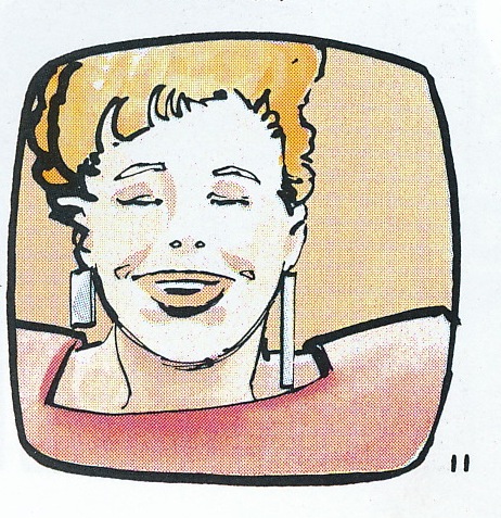
I’m not sure why, maybe it’s because I can’t wear dangly earrings anymore with my gauges, but the asymmetrical nature of newscaster Lola’s earrings caught me every time I saw a frame with her in it. At first I thought maybe there was just some sort of weird bar behind her head, but then as I saw more frames of her in different outfits with different earrings, I realized there had to be some point. This can’t merely be an homage to some sort of sweet 80’s earrings’ style.

Page 11

This got me thinking about asymmetry and symmetry in the graphic novel in general. I thought it was interesting that Lola, the representation of the public’s general knowledge, was displayed as asymmetrical (imperfect, unbalanced, perhaps even flawed), while someone like Batman is illustrated as generally symmetrical, despite his internal warring halves. Even his symbol is symmetrical, further suggesting that Batman’s warring sides (Batman and Bruce Wayne) are not so much a flaw in his character, but the essence of what makes him good (in the moral sense). Batman is within himself a system of checks and balance, the Batman trying to ensure Gotham’s criminal are punished, and Bruce Wayne reeling the Batman in when necessary.

Page 59

Lola, however, has no two sides, no full scope, merely reporting the misery of Gotham day after day. As a symbol of public knowledge, and therefore (maybe stretching this a bit…) the public itself, Lola’s asymmetry exposes the unchecked, unbalanced nature of the public, and perhaps the reason Gotham’s society cannot “take care” of itself. Gotham needs Batman, a hero whose moral compass requires no vetting when both of his sides continually keep him in check.

But that doesn’t mean we don’t have be wary of symmetry. I mean, look at Harvey Dent, the near epitome of symmetry now that he’s had plastic surgery. Though, I don’t think Harvey’s situation is quite the same as Batman’s, since Dent is not two warring persons so much as he is a person who has truly succumbed to his demons.