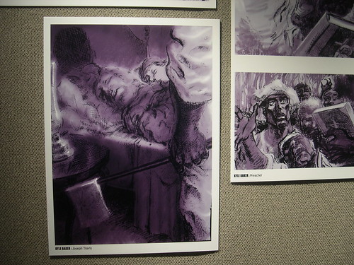
When I heard that Nat Turner wouldn’t have any text, or, rather, would have very limited text, part of me was worried. I must still admit that it was only a small part of me that worried, because I learned from Dark Knight alone that graphic novel pictures can pack a heck of a punch. I found myself thinking how quick of a read Nat Turner would be, but that wasn’t the case. I spent minutes on every panel dissecting it, trying to distinguish the background shading from the skin, the action indicators from the weapons, and sometimes, it took me a while simply to register what I was looking at. There was so much that was grotesque, disturbing, and/or weighted, that at times I didn’t know where to look or what I was supposed to be seeing until I looked again…and again. (For example page 198 top panel. I can see clearly now that it is a headless body on a table and that the actual head is being held by the man on the right, but when I first quickly looked at it, I couldn’t tell for seconds what any of it was.)
I definitely was forced often to slow down and “read” the pictures. I had to stop and stare to digest what was going on before I could move to the next page or the next detail. And then, what I did see, I am haunted by. How naïve was I to find Maus disturbing? (Half joking here…) Maus still has its moments, but there is much more gruesomeness being enacted for you on the pages here that the violence is shown in the forefront, even when we only see bubbles of the aftermath.
The preface of Nat Turner is very appropriately written, as I was glad to have read it once I finished the novel. Baker calls his story the “perfect subject for a comic book,” and I think, to some extent that that is true (6). The sentence long explanations that the history books give on Nat Turner do not drive home what happened. The history we are taught lets us glaze over the gritty details, but also don’t let us forget that something of significance did happen at the same time. By using such a visual medium to show this story, it is harder for the reader to leave with the same understanding of the Nat Turner rebellion. Even when it is hard to understand what you are seeing in the panels, you are still left with a sentiment for what it going on within them.
This is a story that reminded me of a class discussion. I couldn’t handle these same panels in color. It’s a lot to take in with just the shades of brown, black, and gray. If in these muted tones it still overrides the senses, I can’t imagine what it would be like all in color. In fact, I think it would have made it too “cartoony” even if the cartoon would be completely disturbing. As it stands, it almost shows as an old time photo in its sepia tones. To be in color like it is on the cover would lend itself to a strictly over the top horror genre that I think would be too distracting. Shading and blending make this book have depth; line confusion and make the pictures have more weight. To add color would be to get rid of the confusion for where lines stop and would make the picture clearer, which I think would come to the detriment of art itself.

~Kelley